Project Overview
This project aimed to design a website for 'Hotel UX', a fictitious hotel start-up company. The company specified that the online experience is fast, easy, and intuitive: one that’s based on a deep understanding of their target users.
The end goal was to design and build a clickable prototype that can be tested with users, along with a detailed set of wireframes, that can be handed over to both UI designers and then developers.
The end goal was to design and build a clickable prototype that can be tested with users, along with a detailed set of wireframes, that can be handed over to both UI designers and then developers.
My Contributions
Everything detailed in this project has been completed by myself. I am responsible for all research and UX design. This project is research based and the focus is on the usability of the product. In a real world scenario this project would be passed over to UI designers and then developers.
Research
Competitive benchmarking
Survey
Usability testing
Survey
Usability testing
Competitive benchmarking
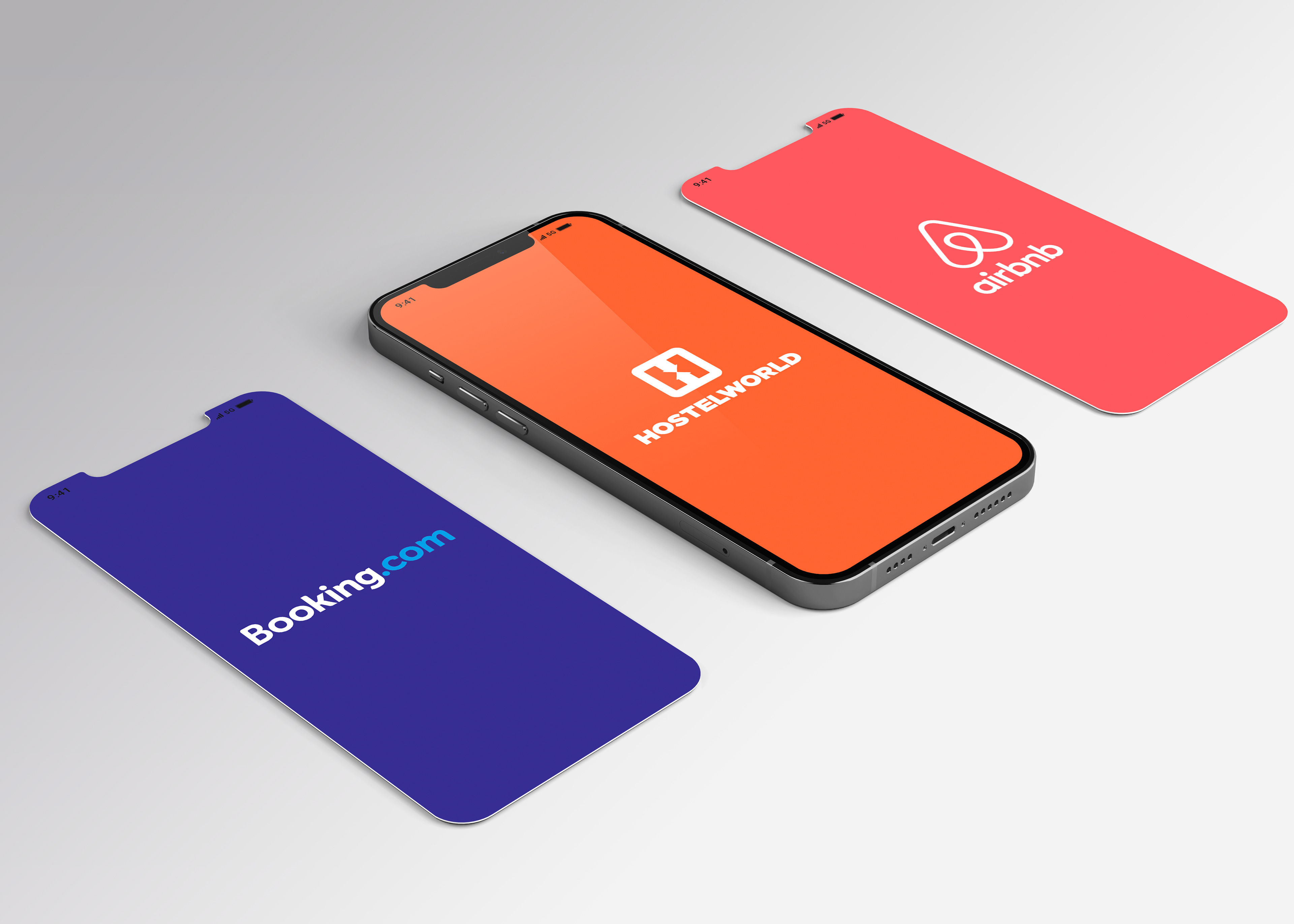
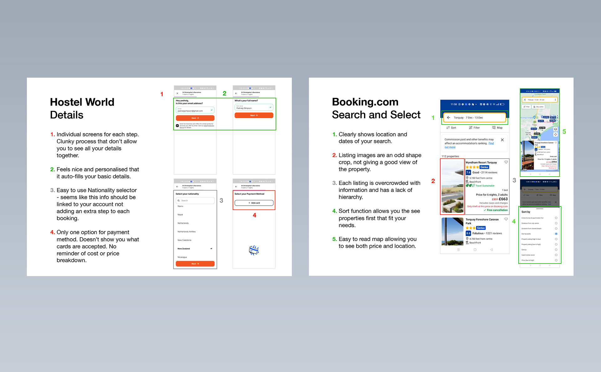
To better understand the usability of hotel booking apps, I have looked at and compared the usability of 3 leading applications. The apps compared in this research were AirBnB, Booking.com and HostelWorld. These apps work in slightly different spaces but share the same goal.
The objectives of this project were:
Learn where industry-leading apps have positive/pain points while trying to solve the same problems as us.
Understand the conventions we should follow.
Highlight the best practices we should emulate.
Research
Competitive benchmarking
Survey
Usability testing
Survey
Usability testing
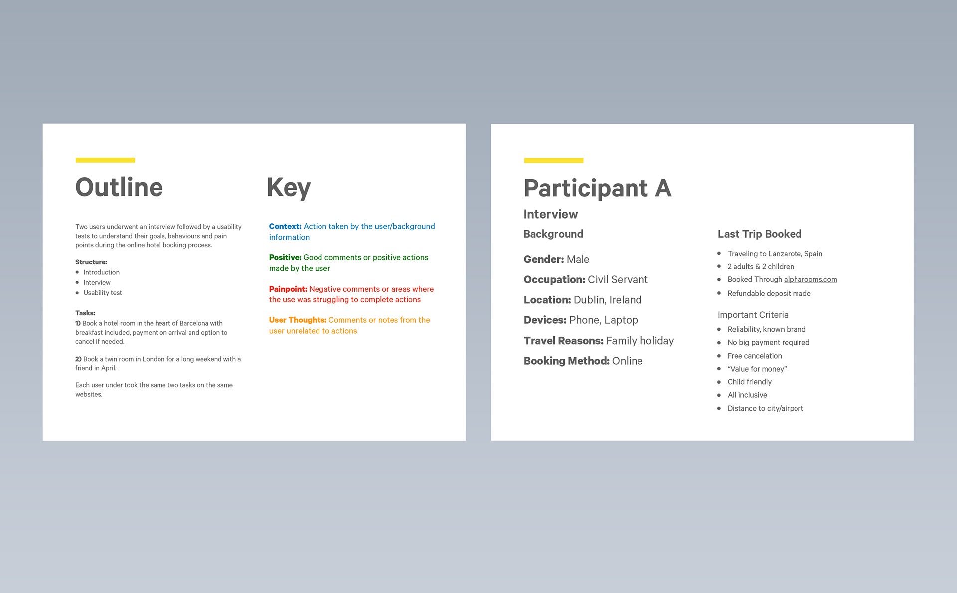
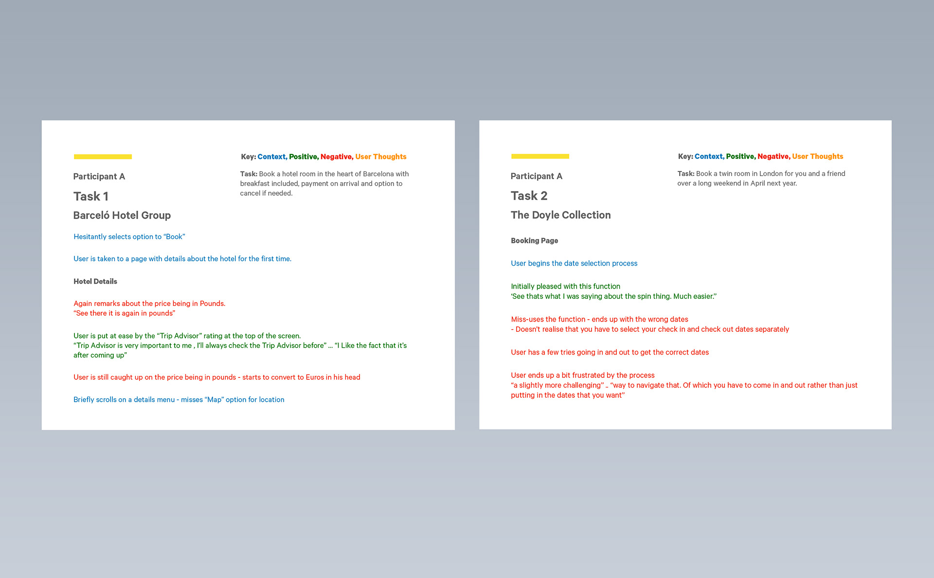
Usability Test
Hotel UX is a ficticious website and was to be built from scratch so in this instance we tested competitor apps. I conducted my own usability test on CitizenM and All.com. I also reviewed two other usability tests prior to my research; apps tested were Barcelo Hotel Group and The Doyle Collection.
The usability test allowed me to observe the user interacting with the apps and note their mental models, behaviour and pain points with the booking process.
The test involved an in-depth interview prior to the test to help gain insight to the users goals and previous booking experiences.
Findings and insights
Being able to find a hotels location is important to users - emphasizing the need for map/directions.
Important to follow commonly used calendar conventions to avoid user confusion.
Ease of navigation and clear flow is important.
Use of customer ratings adds to user trust levels.
Users appreciate being shown important booking policies (free cancelation and no pre-payment).
Price not being in the users native currency can confuse.
Analysis
Affinity diagram
Customer journey map
Customer journey map
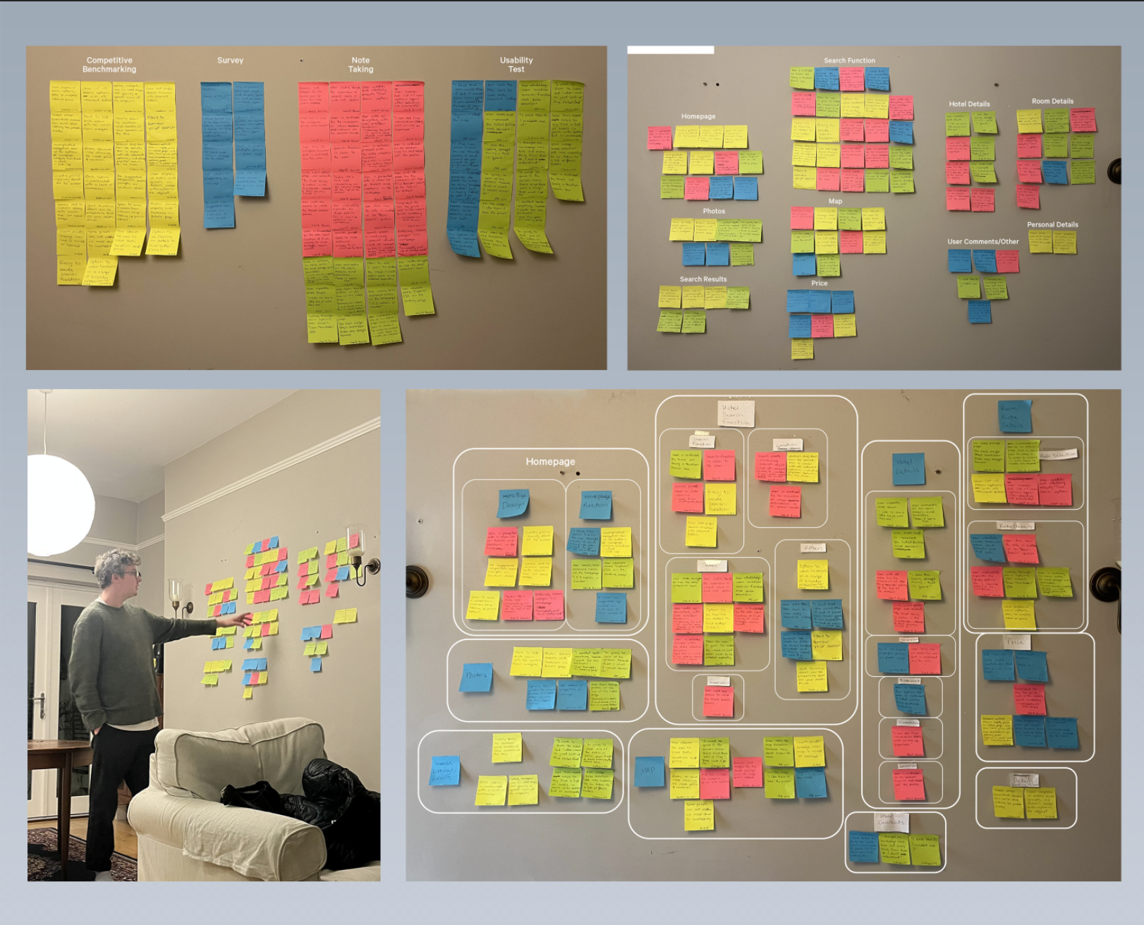
Affinity Diagram
The next part of the process was to collect all the data from the research stage; competitive benchmarking, online surveys and usability tests. As a lot of this data is qualitative, I needed a logical way to organise it, which is why I used an affinity diagram. The first step was to write out key findings and observations on post-it notes and organise them into groups.
The groups that emerged were:
Homepage (Homepage design, Homepage function)
Search Function (Search function, Location, Dates, Guest selection, Filters)
Search Results (Listings, Map)
Hotel Details (Hotel Details, Comparison, Bookmark, Cancelation, Location)
Room/Rates Details (Room Selection, Rate Details, Price)
Personal Details
User Comments
Search Function (Search function, Location, Dates, Guest selection, Filters)
Search Results (Listings, Map)
Hotel Details (Hotel Details, Comparison, Bookmark, Cancelation, Location)
Room/Rates Details (Room Selection, Rate Details, Price)
Personal Details
User Comments
Analysis conclusions
Confusion surrounding important functions needs to be minimised.
Navigation needs to be clear from the beginning.
Price needs to be shown to the user for the entire stay and per night - no hidden costs.
The location of a property needs to be clear to users.
The design needs to be minimal - no overcrowding with information.
Analysis
Affinity diagram
Customer journey map
Customer journey map
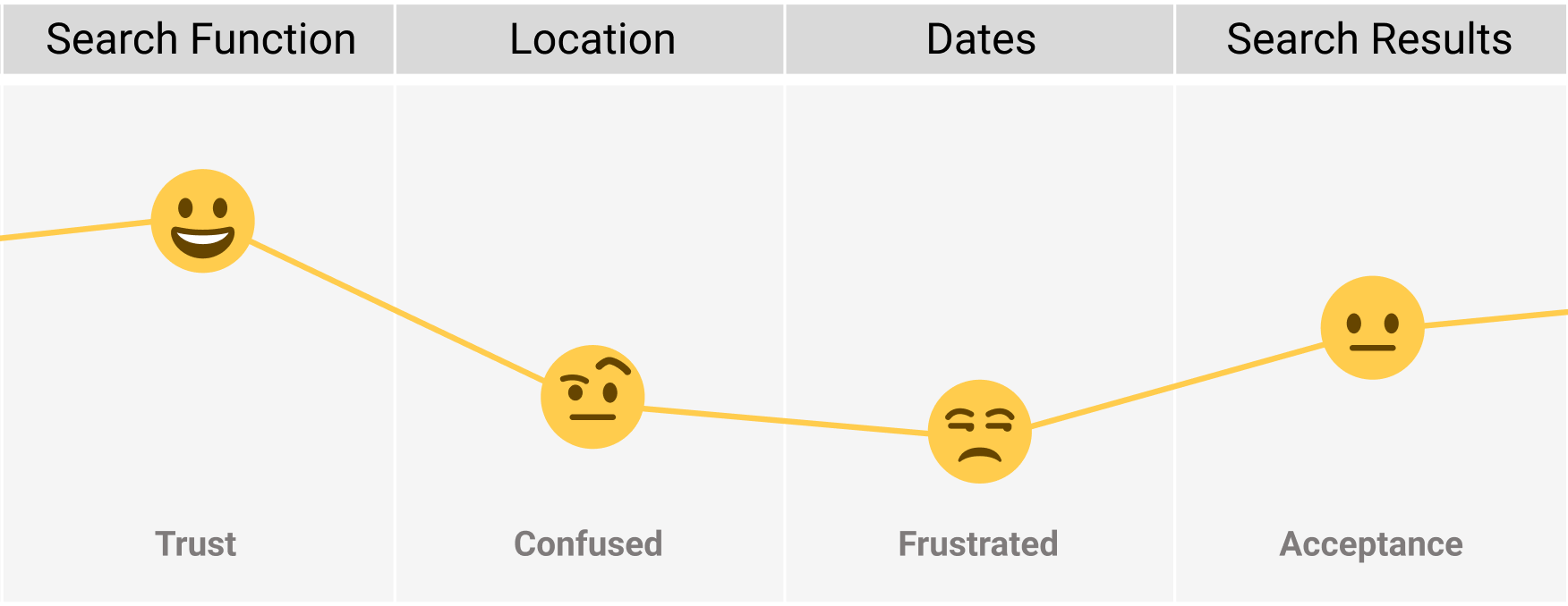
Customer Journey Map
After collating all the data, I went through each step of the user's journey in the booking process to determine how Hotel Ux could improve. Each stage focused on the users goals, behaviours, positive points and pain point in the process. I used quotes from the usability test to provide further insights.
Findings
This process found that users had issues in a number of steps of the booking process. Because of this, the major focus in the design stage would be on the location and date aspects of the search function. There would also be attention toward hotel details, photos and pricing.
Design
Flow diagram
Interaction design - Sketches
Prototype
Wireframes
Interaction design - Sketches
Prototype
Wireframes
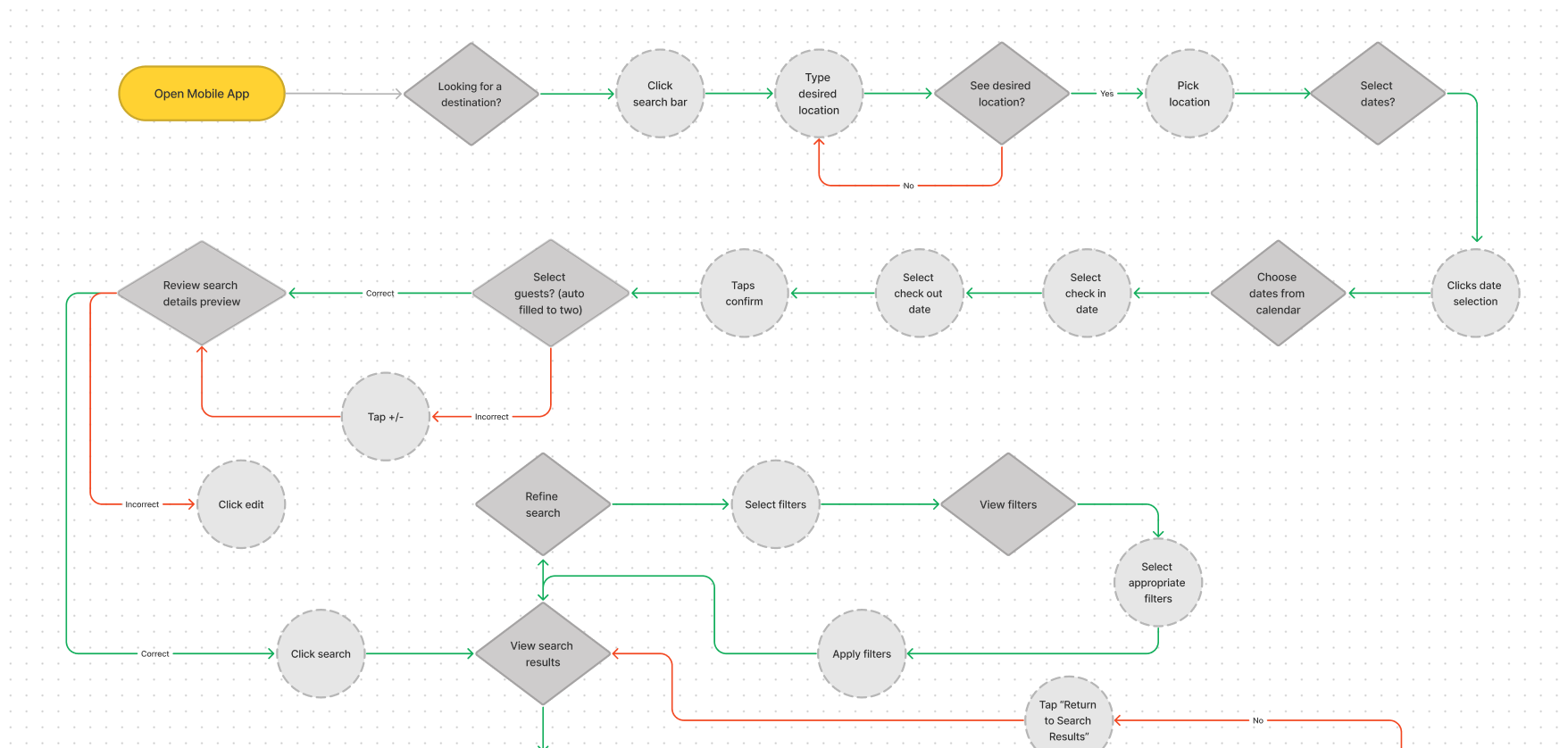
Flow Diagram
The initial part of the design stage was focused on mapping out the users flow throughout the app, starting with the homepage and ending with payment details. The flow follows the happy path, a smooth error-free path through the booking process.
Through the flow I have tried to address all of the pain points identified in the analysis. Through the flow of the search function these pain points have been removed by limiting the amount of decisions the user has to make in order to move on.
Design
Flow diagram
Interaction design - Sketches
Prototype
Wireframes
Interaction design - Sketches
Prototype
Wireframes
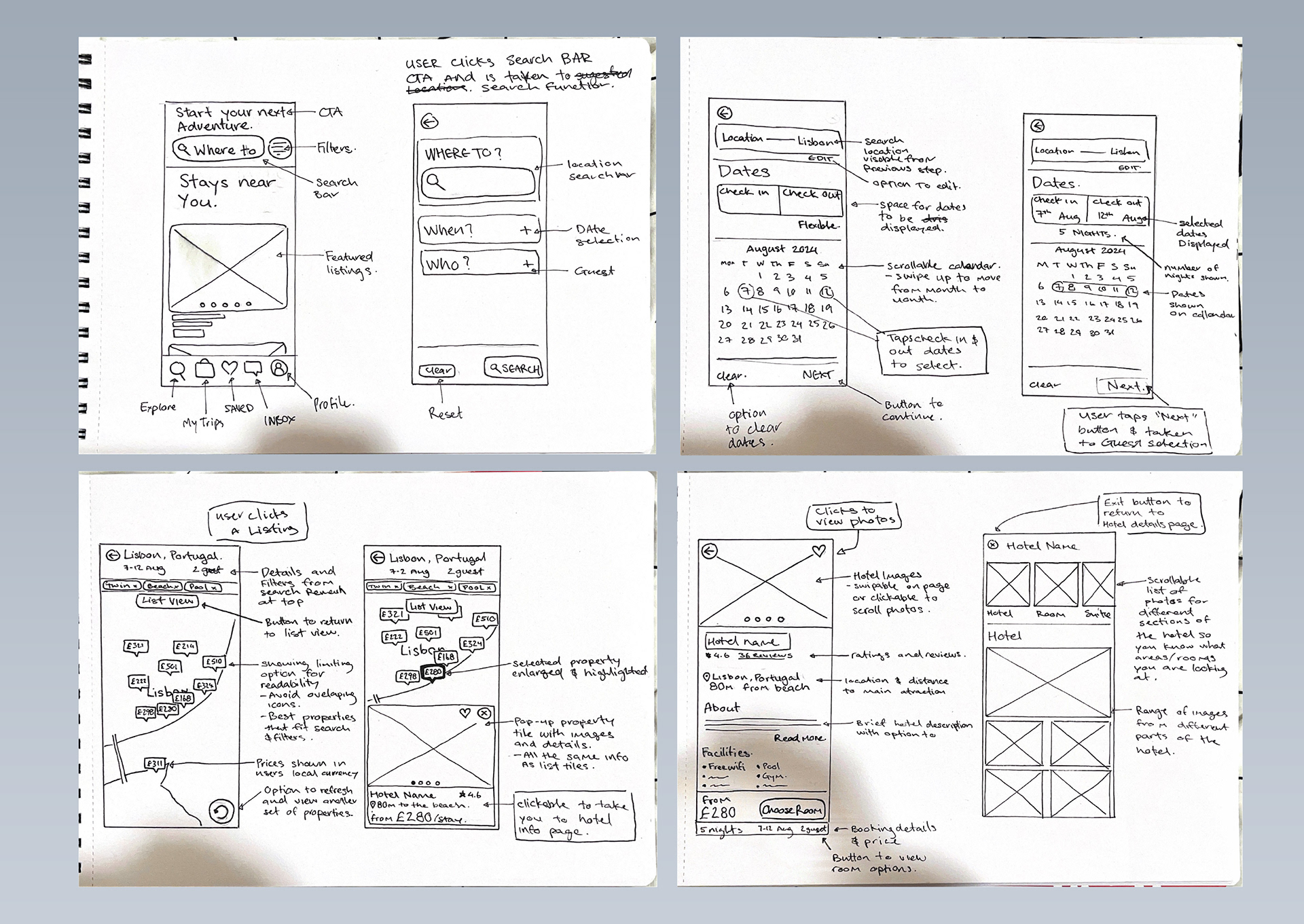
Interaction Design - Sketches
After mapping the user flow I began to translate the user flow into a sequence of screens and screen states through sketches. These sketches would roughly outline the look and feel of the interactions a user would have with the Hotel UX app.
Like the user flow diagram, the sketches were designed to consider the user goals, behaviours and paint points that were discovered during the research and analysis phase.
The focus in these sketches was making it clear to the user where they needed to go to make their booking decisions. Showing them a clear flow through the search process and displaying all the relevant information about decisions they have made and where they need to go to complete the next step.
Design
Flow diagram
Interaction design - Sketches
Prototype
Wireframes
Interaction design - Sketches
Prototype
Wireframes
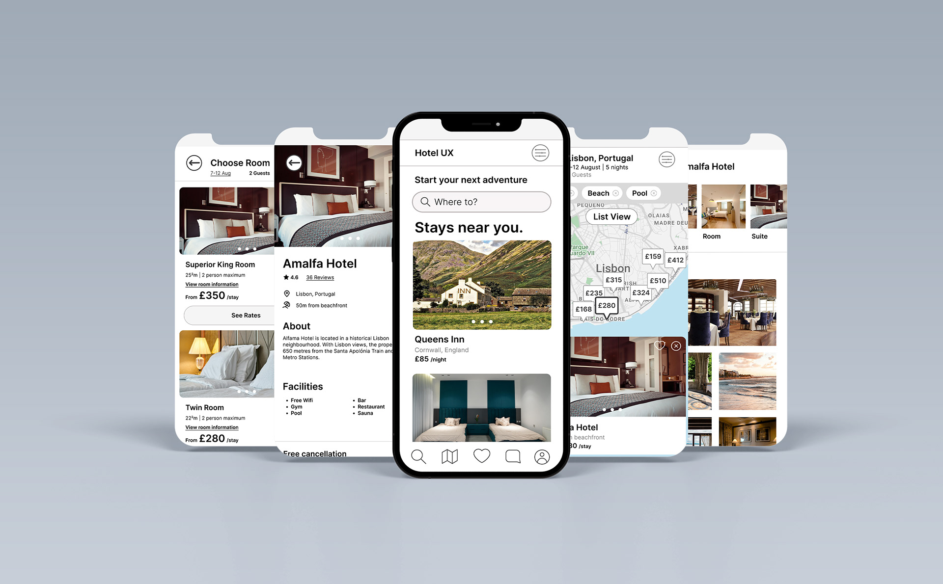
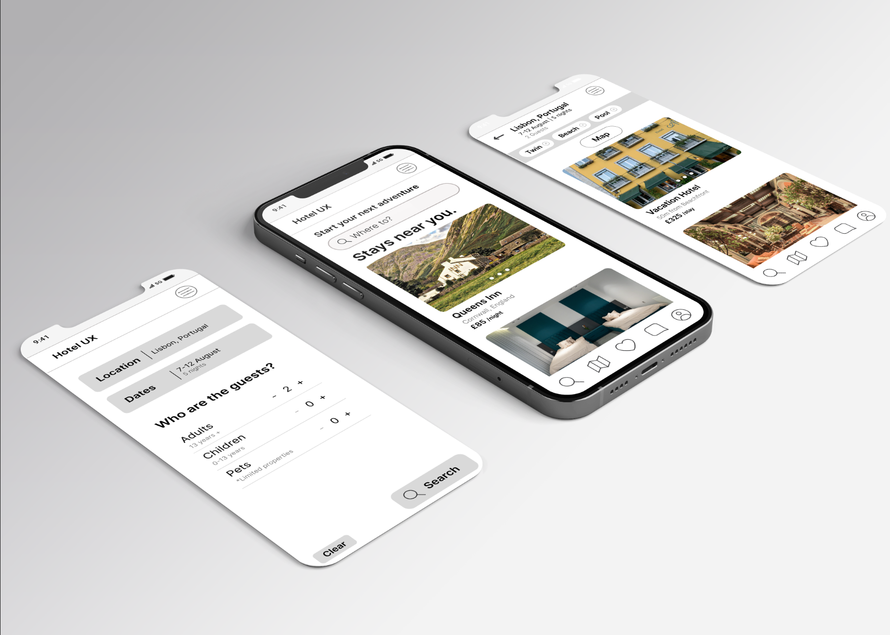
Prototype
The next stage of the process was prototyping. I decided to go with a medium/high fidelity prototype, as these prototypes have the ability to convey richer interactions from the user and gain greater data and insights.
The design then went through more user testing to either validate or find flaws in the design.
N.B. As this is a prototype, not all of the prototype is interactable, however, hints are given if needed. It is also important to note that I have designed the prototype with UX in mind and in the real world the UI would need some tweaking.
Design
Flow diagram
Interaction design - Sketches
Prototype
Wireframes
Interaction design - Sketches
Prototype
Wireframes
Wireframes
The last step of the UX process is to create high-quality annotated wireframes as part of handover documentation for developers or UI designers. All pages, screen states, components and interactions have been explained to avoid any confusion.